Touch Panel ESP32
by OXRS Core Team
SKU: OXRS-IO-TouchPanel-ESP32-FW
Introduction
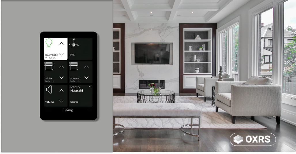
Touch Panel ESP32 is a firmware for a series of smart capacitive LCD touchscreen devices. These low-cost devices typically comprise a small colour touchscreen of around 3.5 or 4 inches and in various aspect ratios, ESP32, and options for hardware expansion. The firmware provides a user interface that complements your existing home or buildings automation system by providing elements such as tiles or keypads presented on a given "screen", and the user may switch between screens.
The unit uses MQTT to provide control of your existing automation hub, and MQTT is used to provide feedback to UI elements, as well as to provide means of dynamic configuration of screens and other settings.
Most of the supported devices may be flashed straight out of the box with the firmware available below, joined to wi-fi or wired ethernet, then configured remotely using OXRS Admin, which is a single HTML file that targets a given unit by IP address. The unit is then further configured by OXRS Admin or MQTT.
Touch Panel ESP32 may best be described as a "thin client"; that is, it sends messages when buttons are pressed, and updates the UI when messages are received, but automation states are not stored within Touch Panel ESP32 itself.
Example applications include: a light switch to control dimming or colour for multiple lights in a room or to initiate scene selection, an intruder alarm panel allowing keycode entry to set or unset the alarm and visual feedback to show the state, or a weather monitor. The built-in tile and screen management, along with external tools to create and upload your own icons, combine to make a panel with infinite possibilities for home or buildings control and monitoring.
Getting Started
- Firmware Installation
- Sending Tile Payloads
- Sending Screen Payloads
- Sending Device Payloads
- Receiving MQTT Payloads
Supported Hardware
- WT32-SC01 ESP32 TFT: 3.5-inch 320x480px Read more
- WT32-SC01 PLUS TFT: an improved version of the above 3.5-inch 320x480px
- WT32S3-86V: 3.95-inch 480x480px touch panel comprising integrated backbox and suitable for UK size backboxes
- WT32S3-86S: an improved version of the above 3.95-inch 480x480px
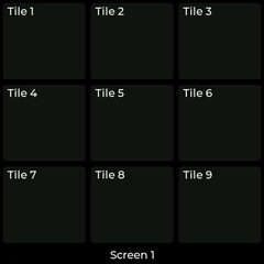
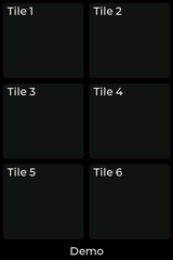
Note that the 320x480px panels support a deault 2x3 tile configuration and the 480x480px variants support a default 3x3 tile configuration.
Prerequisites:
- A touch panel: see above.
- The firmware: OXRS-IO-TouchPanel-ESP32-FW Github
- OXRS Admin UI: for initial configuration Github
- Automation software such as Node-RED Read more
- MQTT Broker - e.g. Mosquitto, Mosca Wiki
Optional downloads:
- Windows Touchpanel Emulator App OXRS-IO-Touchpanel-WIN-APP. Comes in two variants to emulate the two different aspect ratios currently supported by the physical hardware.
- Web App OXRS-IO-TouchPanel-WEB-APP. Emulate OXRS Touch Panel in a browser.
How to Communicate with your Touch Panel Over MQTT
Broadly speaking, we split MQTT communications into three types:
- Configuration messages. Typically you send these from Node-RED to the panel each time it comes online. These are used to configure tiles and screens.
- Send on the
conf/<device-client-id>topic.
- Send on the
- Command messages. Typically you send these from Node-RED to provide updates to tiles and screens (such as turning a tile on or off, or indicating the level of your lights or blinds within the tile), but they can also do things like dim the display, set screen timeouts, switch screens, handle menus, or update the footer bar.
- Send on the
cmnd/<device-client-id>topic.
- Send on the
- State messages. These are the messages that your touch panel sends back over MQTT when you interact with the touch panel, and you can process them in Node-RED to achieve your various automations.
- Listen to these on the
stat/<device-client-id>topic.
- Listen to these on the
A typical set of nodes or flows in Node-RED will therefore need to be set up to achieve the following:
- Listen to
stat/<device-client-id/lwtto know when that panel came online, at which point you would- Send out a
conf/message to configure it with one or more screens, each with a set of tiles. - Optionally send out a
cmnd/message with any custom icons or tile background images. - Optionally send out a
cmnd/message with other data, for example updates to your footer (e.g. date / time / temperature) at startup, or MQTT payloads to configure tile contents with sub labels or other text that might change later.
- Send out a
- Listen to the
stat/topic, so when a user interacts with the touch panel;- Respond accordingly to actuate your devices or automations within Node-RED
- Depending on your actuators and sensors, listen to their feedback and send out a
cmnd/message to update a tile's view to provide visual feedback to the user
Recommendation:
The recommended way to use the firmware and interact with the Touch Panel and your IoT Devices is via Node-RED and MQTT. They are used to configure, manage state and recieve events.
Further documentation and some example Node-RED Flows will be made available in due course.
General Overview of Screens, Tile Styles, Payloads, and Behaviours
Screens
Each touch panel can be configured with a set of screens. Configuration options can be found here
Navigation thru screens
Swipe gestures are used to navigate thru the screens.
| Gesture | active screen | behavior |
|---|---|---|
| left | tile screen | show next (higher screen number), no action when at last screen |
| right | tile screen | show previous (lower screen number), no action when at screen 1 |
| up | tile screen | show drop down screen select list (including Settings screen |
| down | tile screen | show screen 1 |
| down | pop-up screen | close pop-up, return to caller screen |
Tiles
Each screen can be configured with a set of tiles. Imagine your screen as a grid on which tiles can be placed at any location, where tile position 1 is at the top left, tile position 2 is the next tile along to the right, and so on.
The default tile layout can be changed per screen with the screen configuration
| 3x3 Tile Layout (default for 480x480px screens) | 2x3 Tile Layout (default for 320x480px screens) |
|---|---|
 |  |
Tiles typically have three sets of parameters documented below, corresponding to the three message types discussed above:
configurationparameters, for setting up the tilecommandparameters, for updating the tilestateparameters, for reporting back the user's interaction with that tile.
To re-cap, parameters of each of these types are sent to the conf/, cmnd/, and received on the stat/ MQTT message topics respectively.
Tile payloads are described below in terms of these three parameter types.
General principles - interacting with tiles
Tap or hold - all tiles support these user actions, except the indicator, which doesn't accept user input at all. If you tap a tile, a "single" event is registered immediately. If you press-and-hold, a "hold" event is registered after a certain time has elapsed (approx. just under 1 second) and then when you release the button, a "release" event is registered. No further events are registered during the button continues to be held. This press-and-hold behaviour also applies to other tile types; although some tiles feature additional controls that send repeated messages when held. (Namely the up/down or left/right tile controls.) Tapping or holding a tile will cause the tile to light up for the duration of touch.
State management - don't forget that the touch panel has no knowledge of the state of your IoT device. If you want the tile to indicate that you turned on a light, you then need to send a "state": "on" command back to the tile. This provides excellent flexibility, for example you may have different buttons for different lighting scenes. When a scene is changed, you would then turn on the tile corresponding to the scene that was set (and of course, turn off the tile that was previously turned on). This concept applies to all other tile types that accept an on/off state as well. There is a notable exception to this rule; there's a tile type called buttonUpDownLevel that allows you to control a level such as a light dimming level or blinds level. This has a very basic state management built-in.
Parameters common to all tiles
Labels and Sub-Labels
All tiles allow you to set a label and a subLabel, these are short texts at the bottom of each tile. The label may typically descibe the tile's function, and the subLabel might provide additional information such as when the tile was last pressed ("5 mins ago" / "Yesterday" etc) or other metadata you choose. Note that only labels are set in the tile's config; both can be updated during use via the cmnd/ topic.
Icons
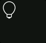
Icons are considered part of the tile's initial configuration (conf/), but a tile icon can of course be swapped-out for a different one later during use as well. There is a limited set of built-in icons available in firmware, but you are free to upload your own, see add a custom icon. Icons are generally vector-like graphics for clear indication of button function.
Text
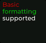
If you send "text": "abc" to the cmnd/ topic then this text will appear in place of any icon, if you've set one. You can set text colour as follows: "text": "#RRGGBB <your_text_here>#", and if you remove the text by sending "text": "", this will restore the original icon in its place.
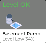
Level display
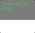
A level command can be sent to any tile with a cmnd/ message. Imagine you wanted to indicate the water level in a tank. Sending "level": 50 to a basic tile with a custom icon or background picture of a water tank will light that tile up from the bottom, to the level you specified. For displaying window blinds or light levels that can actually be controlled, you would use the buttonUpDownLevel tile type, which has additional control buttons to actually change the levels.
Background image

A background image can be sent to any tile. If that tile previously had an icon, you can clear the icon temporarily by sending "text": "" to the cmnd/ topic.
Combining elements
Of course, the above can be combined to create visually rich elements. Here are some examples. More to follow.
Understanding differences between tile types
If we use the basic button tile as a basis for our understanding, this tile type has a lot of options for displaying different elements, but is limited in how you can interact with it; it only accepts tap or hold.
The other tile types provide you with additional types of control:
- controls within the tile (to turn things up and down, link to other screens, etc.)
- controls behind the tile, such that when you press the tile, the screen is taken over by the control screen in question. This is useful for color pickers, menu items, keypads, and more.
Tile Styles
| Tile Style | Tile Example | Get Started |
|---|---|---|
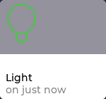
| button | 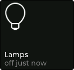 | Get Started |
| buttonUpDownLevel | 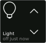 | Get Started |
| buttonSlider | 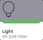 | Get Started |
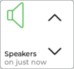
| buttonUpDown | 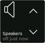 | Get Started |
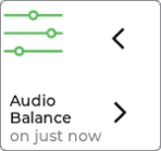
| buttonLeftRight | 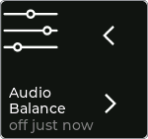 | Get Started |
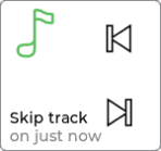
| buttonPrevNext | 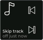 | Get Started |
| indicator | 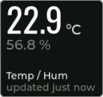 | Get Started |
| feed | 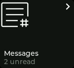 | Get Started |
| colorPickerRgbCct colorPickerRgb colorPickerCct | 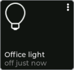 | Get Started Get Started Get Started |
| dropDown | 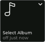 | Get Started |
| buttonSelector | 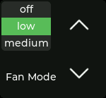 | Get Started |
| remote | 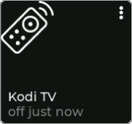 | Get Started |
| link | 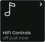 | Get Started |
| thermostat | 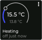 | Get Started |
| keyPad | 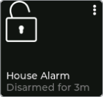 | Get Started |
Tile Payloads
button
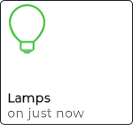
The button is the most basic tile type, in terms of interactivity. It only supports tap or hold events, but like other buttons, its display and feedback options are much more varied (see parameters common to all tiles).
{
  "screens": [
    {
      "screen": 1,
      "label": "Demo",
      "tiles": [
        {
          "tile": 1,
          "style": "button",
          "icon": "_bulb",
          "label": "Lamps"
        }
      ]
    }
  ]
}
JSON parameters
| Parameter | Type | Options | Description | |
|---|---|---|---|---|
tile | Number | n/a | Enter your tile number e.g. 1 | Required |
style | String | n/a | Enter tile style name button | Required |
icon | String | n/a | Enter icon name e.g._bulb | Optional |
label | String | n/a | Enter label text e.g.Lamps | Optional |
conf/<device-client-id>
{
  "screen": 1,
  "tile": 1,
  "style": "button",
  "type": "button",
  "event": "single",
  "state": "off"
}
JSON parameters
| Parameter | Type | Options | Description |
|---|---|---|---|
screen | Number | n/a | Screen number triggering state event |
tile | Number | n/a | Tile number triggering state event |
style | String | n/a | Tile style _thermostat |
type | String | "button" | |
event | String | "single" | "hold" | "release" | Indicates if the button was pressed short or long, or released |
state | String | Object | "on" | "off" | The current tile state (prior to this event) |
stat/<device-client-id>
{
  "tiles": [
    {
      "screen": 1,
      "tile": 1,
      "state": "on",
      "subLabel": "on just now"
    }
  ]
}
JSON parameters
| Parameter | Type | Options | Description | |
|---|---|---|---|---|
screen | Number | n/a | Screen number sending command to | Required |
tile | Number | n/a | Tile number sending command to | Required |
state | String | "on"|"off" | Updated the tile state | Optional |
subLabel | String | n/a | String for additional tile information e.g. "on just now" | Optional |
cmnd/<device-client-id>
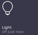
buttonUpDownLevel
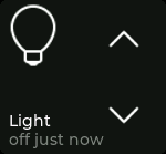
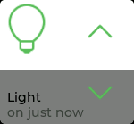
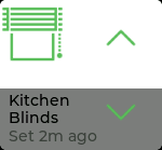
When the tile state is set to on, buttonUpDownLevel provides up/down control with visual feedback, and an internally stored state. As such the output of an up/down button press (or hold) transmits not only the direction of change, but also the new value. A tap will increment or decrement that value by one, and a hold will repeatedly send states in 20 steps across the whole range of the limits you configured. So for a tile configured to dim 0-100, the quickly repeating values would be sent in steps of 5, for example.
The parameters levelTop and levelBottom are used to specify dimming or positional limits. To display a bulb's dimming status (0-100%) visually, you would set levelTop to 100 and levelBottom to 0. To display a roller blind's position visually, where it can be controlled in e.g. 10 steps, you would set levelTop to 0 and levelBottom to 10, thus inverting the level to fill down from the top.
You can update the tile's level, e.g. if something was changed externally, by sending a level payload on the command topic, as with all other tiles.
{
  "screens": [
    {
      "screen": 1,
      "label": "Demo",
      "tiles": [
        {
          "tile": 1,
          "style": "buttonUpDownLevel",
          "icon": "_bulb",
          "label": "Light",
          "levelBottom": 0,
          "levelTop": 100
        }
      ]
    }
  ]
}
JSON parameters
| Parameter | Type | Options | Description | |
|---|---|---|---|---|
tile | Number | n/a | Enter your tile number e.g. 1 | Required |
style | String | n/a | Enter tile style name buttonUpDownLevel | Required |
icon | String | n/a | Enter icon name e.g._bulb | Optional |
label | String | n/a | Enter label text e.g.Ceiling Lamp | Optional |
levelBottom | String | n/a | Defaults to 0 | Optional |
levelTop | String | n/a | Defaults to 100 | Optional |
conf/<device-client-id>
{
  "screen": 1,
  "tile": 1,
  "style": "buttonUpDownLevel",
  "type": "level",
  "event": "up",
  "state": 10
}
JSON parameters
| Parameter | Type | Options | Description |
|---|---|---|---|
screen | Number | n/a | Screen number triggering state event |
tile | Number | n/a | Tile number triggering state event |
style | String | n/a | Tile style buttonUpDownLevel |
type | String | "button"|"level" | Indicates if touch event was a button press or level change |
event | String | "single" | "hold" | "release" | "up" | "down" | Indicates if a button was pressed short or long, or released, or if a level change was up or down |
state | Number | n/a | The new level state (value after level was changed) |
stat/<device-client-id>
{
  "tiles": [
    {
      "screen": 1,
      "tile": 1,
      "state": "on",
      "level": 5,
      "subLabel": "on just now"
    }
  ]
}
JSON parameters
| Parameter | Type | Options | Description | |
|---|---|---|---|---|
screen | Number | n/a | Screen number sending command to | Required |
tile | Number | n/a | Tile number sending command to | Required |
state | String | "on"|"off" | Updated the tile state | Required |
level | Number | n/a | Update the level state | Required |
sublabel | String | n/a | String for additional tile information e.g. "on just now" | Optional |
cmnd/<device-client-id>
TIP
Don't forget that you can send level messages to any tile type, but this is the correct tile to use if you need to be able to control levels using up/down buttons.
buttonSlider
This type is very similar to the buttonUpDownLevel except that the up/down buttons are replaced by a slider.
When the tile state is set to on, buttonSlider provides a slider interface with visual feedback, and an internally stored state. When the tile is touched the top of the level bar shows a green handle to indicate ready for sliding. Moving the handle changes the level which wil be reported as a stat/ payload until the tile is released. Touching the tile without moving will publish singleor hold events as a standard button.
The parameters levelTop and levelBottom are used to specify dimming or positional limits. To display a bulb's dimming status (0-100%) visually, you would set levelTop to 100 and levelBottom to 0. To display a roller blind's position visually, where it can be controlled in e.g. 10 steps, you would set levelTop to 0 and levelBottom to 10, thus inverting the level to fill down from the top.
You can update the tile's level, e.g. if something was changed externally, by sending a level payload on the command topic, as with all other tiles.
{
  "screens": [
    {
      "screen": 1,
      "label": "Demo",
      "tiles": [
        {
          "tile": 1,
          "style": "buttonSlider",
          "icon": "_bulb",
          "label": "Light",
          "levelBottom": 0,
          "levelTop": 100
        }
      ]
    }
  ]
}
JSON parameters
| Parameter | Type | Options | Description | |
|---|---|---|---|---|
tile | Number | n/a | Enter your tile number e.g. 1 | Required |
style | String | n/a | Enter tile style name buttonSlider | Required |
icon | String | n/a | Enter icon name e.g._bulb | Optional |
label | String | n/a | Enter label text e.g.Ceiling Lamp | Optional |
levelBottom | String | n/a | Defaults to 0 | Optional |
levelTop | String | n/a | Defaults to 100 | Optional |
conf/<device-client-id>
Tip
The slider works best if a larger tile is used (see spanning tile).
The horizontal/vertical orientation of the bar depends on the width/height ratio of the tile. (wider tiles : horizontal, higher tiles vertical).
{
  "screen": 1,
  "tile": 1,
  "style": "buttonSlider",
  "type": "level",
  "event": "slide",
  "state": 10
}
JSON parameters
| Parameter | Type | Options | Description |
|---|---|---|---|
screen | Number | n/a | Screen number triggering state event |
tile | Number | n/a | Tile number triggering state event |
style | String | n/a | Tile style buttonUpDownLevel |
type | String | "button"|"level" | Indicates if touch event was a button press or level change |
event | String | "single" | "hold" | "release" | "slide" | Indicates if a button was pressed short or long, or released, or if a level was changed by slide |
state | Number | n/a | The new level state (value after level was changed) |
stat/<device-client-id>
{
  "tiles": [
    {
      "screen": 1,
      "tile": 1,
      "state": "on",
      "level": 5,
      "subLabel": "on just now"
    }
  ]
}
JSON parameters
| Parameter | Type | Options | Description | |
|---|---|---|---|---|
screen | Number | n/a | Screen number sending command to | Required |
tile | Number | n/a | Tile number sending command to | Required |
state | String | "on"|"off" | Updated the tile state | Required |
level | Number | n/a | Update the level state | Required |
sublabel | String | n/a | String for additional tile information e.g. "on just now" | Optional |
cmnd/<device-client-id>
TIP
Don't forget that you can send level messages to any tile type, but this is the correct tile to use if you need to be able to control levels using a slider.
buttonUpDown
This tile type buttonUpDown is similar to buttonUpDownLevel, except that it has no knowledge of states, and sends simple up/down messages rather than e.g. dimming values.
Note that, although not shown here, it's still possible to update the tile's visuals to indicate a dimming level if desired; this is something common to all tile payloads.
{
  "screens": [
    {
      "screen": 1,
      "label": "Demo",
      "tiles": [
        {
          "tile": 1,
          "style": "buttonUpDown",
          "icon": "_speaker",
          "label": "Speakers",
          "levelBottom": 0,
          "levelTop": 100
        }
      ]
    }
  ]
}
JSON parameters
| Parameter | Type | Options | Description | |
|---|---|---|---|---|
tile | Number | n/a | Enter your tile number e.g. 1 | Required |
style | String | n/a | Enter tile style name buttonUpDown | Required |
icon | String | n/a | Enter icon name e.g._speaker | Optional |
label | String | n/a | Enter label text e.g.Speakers | Optional |
levelBottom | String | n/a | Defaults to 0 | Optional |
levelTop | String | n/a | Defaults to 100 | Optional |
conf/<device-client-id>
{
  "screen": 1,
  "tile": 1,
  "style": "buttonUpDown",
  "type": "button",
  "event": "single",
  "state": "on"
}
JSON parameters
| Parameter | Type | Options | Description |
|---|---|---|---|
screen | Number | n/a | Screen number triggering state event |
tile | Number | n/a | Tile number triggering state event |
style | String | n/a | Tile style buttonLevelDown |
type | String | "button"|"up"|"down" | Indicates if touch event was a button press or up/down |
event | String | "single"|"hold"|"release" | Indicates if a button was pressed short or long, or the tile was released |
state | String | "on" | "off" | The current tile state (prior to this event), only included for button press events |
stat/<device-client-id>
{
  "tiles": [
    {
      "screen": 1,
      "tile": 1,
      "state": "on",
      "subLabel": "on just now"
    }
  ]
}
JSON parameters
| Parameter | Type | Options | Description | |
|---|---|---|---|---|
screen | Number | n/a | Screen number sending command to | Required |
tile | Number | n/a | Tile number sending command to | Required |
state | String | "on"|"off" | Updated the tile state | Required |
sublabel | String | n/a | String for additional tile information e.g. "on just now" | Optional |
cmnd/<device-client-id>
buttonLeftRight
This tile type buttonLeftRight is similar to buttonUpDown, except the control buttons face left and right, with corresponding event strings.
{
  "screens": [
    {
      "screen": 1,
      "label": "Demo",
      "tiles": [
        {
          "tile": 1,
          "style": "buttonLeftRight",
          "icon": "_slider",
          "label": "Audio Balance"
        }
      ]
    }
  ]
}
JSON parameters
| Parameter | Type | Options | Description | |
|---|---|---|---|---|
tile | Number | n/a | Enter your tile number e.g. 1 | Required |
style | String | n/a | Enter tile style name buttonLeftRight | Required |
icon | String | n/a | Enter icon name e.g._slider | Optional |
label | String | n/a | Enter label text e.g.Audio Balance | Optional |
conf/<device-client-id>
{
  "screen": 1,
  "tile": 1,
  "style": "buttonLeftRight",
  "type": "button",
  "event": "single",
  "state": "on"
}
JSON parameters
| Parameter | Type | Options | Description |
|---|---|---|---|
screen | Number | n/a | Screen number triggering state event |
tile | Number | n/a | Tile number triggering state event |
style | String | n/a | Tile style buttonLeftRight |
type | String | "button"|"left"|"right" | Indicates if touch event was a button press or left/right press |
event | String | "single"|"hold"|"release" | Indicates if a button was pressed short or long, or the tile was released |
state | String | "on" | "off" | The current tile state (prior to this event), only included for button press events |
stat/<device-client-id>
{
  "tiles": [
    {
      "screen": 1,
      "tile": 1,
      "state": "on",
      "subLabel": "on just now"
    }
  ]
}
JSON parameters
| Parameter | Type | Options | Description | |
|---|---|---|---|---|
screen | Number | n/a | Screen number sending command to | Required |
tile | Number | n/a | Tile number sending command to | Required |
state | String | "on"|"off" | Updated the tile state | Required |
sublabel | String | n/a | String for additional tile information e.g. "on just now" | Optional |
cmnd/<device-client-id>
buttonPrevNext
This tile type buttonPrevNext is similar to buttonLeftRight, except the control buttons are customised for playlist control, with corresponding event strings.
{
  "screens": [
    {
      "screen": 1,
      "label": "Demo",
      "tiles": [
        {
          "tile": 1,
          "style": "buttonPrevNext",
          "icon": "_music",
          "label": "Skip track"
        }
      ]
    }
  ]
}
JSON parameters
| Parameter | Type | Options | Description | |
|---|---|---|---|---|
tile | Number | n/a | Enter your tile number e.g. 1 | Required |
style | String | n/a | Enter tile style name buttonLeftRight | Required |
icon | String | n/a | Enter icon name e.g._music | Optional |
label | String | n/a | Enter label text e.g.Skip track | Optional |
conf/<device-client-id>
{
  "screen": 1,
  "tile": 1,
  "style": "buttonLeftRight",
  "type": "button",
  "event": "single",
  "state": "on"
}
JSON parameters
| Parameter | Type | Options | Description |
|---|---|---|---|
screen | Number | n/a | Screen number triggering state event |
tile | Number | n/a | Tile number triggering state event |
style | String | n/a | Tile style buttonPrevNext |
type | String | "button"|"prev"|"next" | Indicates if touch event was a button press or prev/next |
event | String | "single"|"hold"|"release" | Indicates if a button was pressed short or long, or the tile was released |
state | String | "on" | "off" | The current tile state (prior to this event), only included for button press events |
stat/<device-client-id>
{
  "tiles": [
    {
      "screen": 1,
      "tile": 1,
      "state": "on",
      "subLabel": "on just now"
    }
  ]
}
JSON parameters
| Parameter | Type | Options | Description | |
|---|---|---|---|---|
screen | Number | n/a | Screen number sending command to | Required |
tile | Number | n/a | Tile number sending command to | Required |
state | String | "on"|"off" | Update the tile state | Required |
sublabel | String | n/a | String for additional tile information e.g. "on just now" | Optional |
cmnd/<device-client-id>
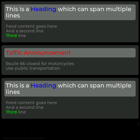
feed
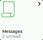
This tile type feed when pressed presents a full screen, vertically scrollable list of messages. Up to 5 messages are retained, with any new message(s) replacing older messages. The newest message is displayed at the top.
This tile has no status feedback; tapping the tile itself only presents the feed screen.
{
  "screens": [
    {
      "screen": 1,
      "label": "Demo",
      "tiles": [
        {
          "tile": 1,
          "style": "feed",
          "icon": "_feed",
          "label": "Messages"
        }
      ]
    }
  ]
}
JSON parameters
| Parameter | Type | Options | Description | |
|---|---|---|---|---|
tile | Number | n/a | Enter your tile number e.g. 1 | Required |
style | String | n/a | Enter tile style name feed | Required |
icon | String | n/a | Enter icon name e.g._news | Optional |
label | String | n/a | Enter label text e.g.Messages | Optional |
conf/<device-client-id>
{
  "tiles": [
    {
      "screen": "1",
      "tile": "2",
      "state": "off",
      "subLabel": "2 Unread",
      "messageFeed": {
        "addPost": {
          "id": 1,
          "head": "#ff0000 Taffic Announcement#",
          "body": "Route 66 closed for motorcycles\nUse public transportation"
        }
      }
    },
    {
      "screen": "1",
      "tile": "2",
      "state": "off",
      "subLabel": "2 Unread",
      "messageFeed": {
        "addPost": {
          "id": 2,
          "head": "This is a #0000ff Heading# which can span multiple lines",
          "body": "Feed content goes here\nAnd a second line \n#00ff00 Third# line"
        }
      }
    }
  ]
}
JSON parameters
| Parameter | Type | Options | Description | |
|---|---|---|---|---|
screen | Number | n/a | Screen number sending command to | Required |
tile | Number | n/a | Tile number sending command to | Required |
state | String | "on"|"off" | Update the tile state | Required |
sublabel | String | n/a | String for additional tile information e.g. "on just now" | Optional |
messageFeed | Object | n/a | An object containing keys id, head, and body | Optional |
id | Number | n/a | Message ID | Optional |
head | String | n/a | String containing the message heading | Optional |
body | String | n/a | String containing the message text | Optional |
cmnd/<device-client-id>
Feed screen:
The feed screen is not clickable, but it's possible to drag the finger to scroll up and down if the message list extends beyond the bottom of the screen. Swipe down to return to the previous screen.
indicator
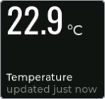
This tile type indicator is typically used to provide sensor data. Although it's most suited to temperature / humidity readings, the units may be customised for other types of sensor data e.g. lux. As it's a display-only tile, no feedback state is associated with it.
{
  "screens": [
    {
      "screen": 1,
      "label": "Demo",
      "tiles": [
        {
          "tile": 1,
          "style": "indicator",
          "label": "Temp / Hum"
        }
      ]
    }
  ]
}
JSON parameters
| Parameter | Type | Options | Description | |
|---|---|---|---|---|
tile | Number | n/a | Enter your tile number e.g. 1 | Required |
style | String | n/a | Enter tile style name indicator | Required |
label | String | n/a | Enter label text e.g.Temp / Hum | Optional |
conf/<device-client-id>
{
  "tiles": [
    {
      "screen": 1,
      "tile": 1,
      "number": {
        "value": "22.9",
        "units": "°C",
        "subValue": "56.8",
        "subUnits": "%"
      },
      "subLabel": "updated just now"
    }
  ]
}
JSON parameters
| Parameter | Type | Options | Description | |
|---|---|---|---|---|
screen | Number | n/a | Screen number sending command to | Required |
tile | Number | n/a | Tile number sending command to | Required |
number | Object | n/a | Required | |
value | String | n/a | Formatted value to display e.g. 22.9 (restricted to 0...9 + - . : ) | Optional |
units | String | n/a | Suffix/unit e.g. "°C" | Optional |
subValue | String | n/a | Formatted sub-value to display e.g. 56.8 | Optional |
subUnits | String | n/a | Suffix/unit e.g. "%" | Optional |
sublabel | String | n/a | String for additional tile information e.g. "updated just now" | Optional |
cmnd/<device-client-id>
colorPickerRgbCct
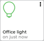
This tile type colorPickerRgbCct may be used to facilitate changing the color of lights via both RGB wheel and CCT slider.
{
  "screens": [
    {
      "screen": 1,
      "label": "Demo",
      "tiles": [
        {
          "tile": 1,
          "style": "colorPickerRgbCct",
          "icon": "_bulb",
          "label": "Office light"
        }
      ]
    }
  ]
}
JSON parameters
| Parameter | Type | Options | Description | |
|---|---|---|---|---|
tile | Number | n/a | Enter your tile number e.g. 1 | Required |
style | String | n/a | Enter tile style name colorPickerRgbCct | Required |
icon | String | n/a | Enter icon name e.g._bulb | Optional |
label | String | n/a | Enter label text e.g.Office light | Optional |
conf/<device-client-id>
{
  "screen": 1,
  "tile": 1,
  "style": "colorPickerRgbCct",
  "type": "colorPicker",
  "event": "change",
  "state": {
    "colorRgb": {
      "r": 255,
      "g": 124,
      "b": 208
    },
    "colorKelvin": 0,
    "brightness": 0
  }
}
JSON parameters
| Parameter | Type | Options | Description |
|---|---|---|---|
screen | Number | n/a | Screen number triggering state event |
tile | Number | n/a | Tile number triggering state event |
style | String | "colorPickerRgbCct" | Tile style colorPickerRgbCct |
type | String | "button" | "colorPicker" | Indicates if touch event was a button press or a change on the colorPicker control screen |
event | String | "single"|"hold"|"release"|"change" | single , hold , release events only on type button. change events only on type colorPicker |
state | String | Object | "on" | "off" | {} | The current tile state |
colorRgb | Object | n/a | |
r | Number | n/a | Red colour Number between 0-255 |
g | Number | n/a | Green colour Number between 0-255 |
b | Number | n/a | Blue colour Number between 0-255 |
colorKelvin | Number | n/a | For temperature mode, color temp (in kelvin) |
brightness | Number | n/a | For temperature mode, white brightness |
stat/<device-client-id>
{
  "tiles": [
    {
      "screen": 1,
      "tile": 1,
      "state": "on",
      "colorPicker": {
        "mode": "colorRgb",
        "colorRgb": {
          "r": 255,
          "g": 0,
          "b": 0
        },
        "colorKelvin": 0,
        "brightness": 50
      },
      "subLabel": "on just now"
    }
  ]
}
JSON parameters
| Parameter | Type | Options | Description | |
|---|---|---|---|---|
screen | Number | n/a | Screen number sending command to | Required |
tile | Number | n/a | Tile number sending command to | Required |
state | String | "on"|"off" | Update the tile state | Optional |
colorPicker | Object | n/a | Optional | |
mode | String | "colorRgb"|"colorKelvin" | Update the color picker mode | Optional |
colorRgb | Object | n/a | For RGB mode, update the selected color (in RGB) | Optional |
r | Number | n/a | Red colour Number between 0-255 | Optional |
g | Number | n/a | Green colour Number between 0-255 | Optional |
b | Number | n/a | Blue colour Number between 0-255 | Optional |
colorKelvin | Number | n/a | For temperature mode, update the selected color temp (in kelvin) | Optional |
brightness | Number | n/a | For either mode, update the selected color brightness | Optional |
subLabel | String | n/a | String for additional tile information e.g. last updated "on just now" | Optional |
cmnd/<device-client-id>
Control Screen:
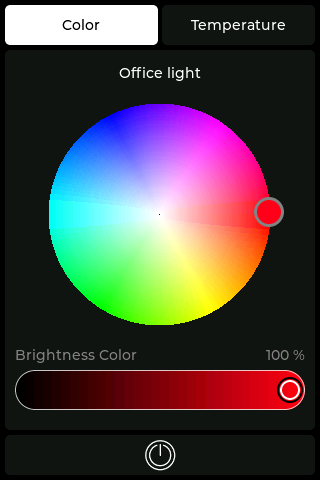
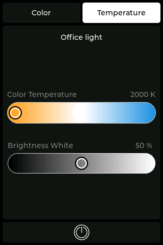
When you press the tile button the controls screen will appear. The controls screen has two tabs to choose from Color and Temperature. The color tab gives you the ability to adjust the RGB Color via the color wheel and Brightness Color via the slider. The temperature tab gives you the ability to adjust the Color Temperature and Brightness White via the sliders. You can also toggle the tile on | off by pressing the light bulb button at the bottom of the popup.
colorPickerRgb
This tile type colorPickerRgb may be used to facilitate changing the color of lights via an RGB wheel.
{
  "screens": [
    {
      "screen": 1,
      "label": "Demo",
      "tiles": [
        {
          "tile": 1,
          "style": "colorPickerRgb",
          "icon": "_bulb",
          "label": "Office light"
        }
      ]
    }
  ]
}
JSON parameters
| Parameter | Type | Options | Description | |
|---|---|---|---|---|
tile | Number | n/a | Enter your tile number e.g. 1 | Required |
style | String | n/a | Enter tile style name colorPickerRgb | Required |
icon | String | n/a | Enter icon name e.g._bulb | Optional |
label | String | n/a | Enter label text e.g.Office light | Optional |
conf/<device-client-id>
{
  "screen": 1,
  "tile": 1,
  "style": "colorPickerRgb",
  "type": "colorPicker",
  "event": "change",
  "state": {
    "colorRgb": {
      "r": 255,
      "g": 124,
      "b": 208
    },
    "colorKelvin": 0,
    "brightness": 0
  }
}
JSON parameters
| Parameter | Type | Options | Description |
|---|---|---|---|
screen | Number | n/a | Screen number triggering state event |
tile | Number | n/a | Tile number triggering state event |
style | String | "colorPickerRgb" | Tile style colorPickerRgb |
type | String | "button" | "colorPicker" | Indicates if touch event was a button press or a change on the colorPicker control screen |
event | String | "single"|"hold"|"release"|"change" | single , hold , release events only on type button. change events only on type colorPicker |
state | String | Object | "on" | "off" | {} | The current tile state |
colorRgb | Object | n/a | |
r | Number | n/a | Red colour Number between 0-255 |
g | Number | n/a | Green colour Number between 0-255 |
b | Number | n/a | Blue colour Number between 0-255 |
colorKelvin | Number | 0 | For temperature mode, color temp (in kelvin) 0 |
brightness | Number | 0 | For temperature mode, brightness white 0 |
stat/<device-client-id>
{
  "tiles": [
    {
      "screen": 1,
      "tile": 1,
      "state": "on",
      "colorPicker": {
        "mode": "colorRgb",
        "colorRgb": {
          "r": 255,
          "g": 0,
          "b": 0
        },
        "brightness": 50
      },
      "subLabel": "on just now"
    }
  ]
}
JSON parameters
| Parameter | Type | Options | Description | |
|---|---|---|---|---|
screen | Number | n/a | Screen number sending command to | Required |
tile | Number | n/a | Tile number sending command to | Required |
state | String | "on"|"off" | Updated the tile state | Optional |
colorPicker | Object | n/a | Optional | |
mode | String | "colorRgb"|"colorKelvin" | Update the color picker mode | Optional |
colorRgb | Object | n/a | For RGB mode, update the selected color (in RGB) | Optional |
r | Number | n/a | Red colour Number between 0-255 | Optional |
g | Number | n/a | Green colour Number between 0-255 | Optional |
b | Number | n/a | Blue colour Number between 0-255 | Optional |
brightness | Number | n/a | For either mode, update the selected color brightness | Optional |
subLabel | String | n/a | String for additional tile information e.g. last updated "on just now" | Optional |
cmnd/<device-client-id>
Control Screen:
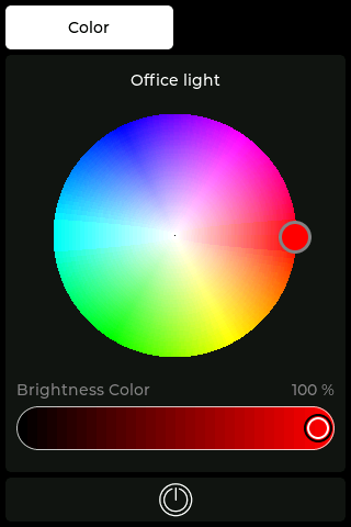
When you press the tile button the controls screen will appear giving you the ability to adjust the RGB Color via the color wheel and Brightness Color via the slider. You can also toggle the tile on | off by pressing the light bulb button at the bottom of the popup.
colorPickerCct
This tile type colorPickerCct may be used to facilitate changing the color of lights via a CCT slider.
{
  "screens": [
    {
      "screen": 1,
      "label": "Demo",
      "tiles": [
        {
          "tile": 1,
          "style": "colorPickerCct",
          "icon": "_bulb",
          "label": "Office light"
        }
      ]
    }
  ]
}
JSON parameters
| Parameter | Type | Options | Description | |
|---|---|---|---|---|
tile | Number | n/a | Enter your tile number e.g. 1 | Required |
style | String | n/a | Enter tile style name colorPickerCct | Required |
icon | String | n/a | Enter icon name e.g._bulb | Optional |
label | String | n/a | Enter label text e.g.Office light | Optional |
conf/<device-client-id>
{
  "screen": 1,
  "tile": 1,
  "style": "colorPickerCct",
  "type": "colorPicker",
  "event": "change",
  "state": {
    "colorRgb": {
      "r": 0,
      "g": 0,
      "b": 0
    },
    "colorKelvin": 4000,
    "brightness": 50
  }
}
JSON parameters
| Parameter | Type | Options | Description |
|---|---|---|---|
screen | Number | n/a | Screen number triggering state event |
tile | Number | n/a | Tile number triggering state event |
style | String | "colorPickerCct" | Tile style colorPickerCct |
type | String | "button" | "colorPicker" | Indicates if touch event was a button press or a change on the colorPicker control screen |
event | String | "single"|"hold"|"release"|"change" | single , hold , release events only on type button. change events only on type colorPicker |
state | String | Object | "on" | "off" | {} | The current tile state |
colorRgb | Object | n/a | |
r | Number | 0 | Red colour Number 0 |
g | Number | 0 | Green colour Number 0 |
b | Number | 0 | Blue colour Number 0 |
colorKelvin | Number | n/a | For temperature mode, color temp (in kelvin) |
brightness | Number | n/a | For temperature mode, brightness white |
stat/<device-client-id>
{
  "tiles": [
    {
      "screen": 1,
      "tile": 1,
      "state": "on",
      "colorPicker": {
        "colorKelvin": 2000,
        "brightness": 50
      },
      "subLabel": "on just now"
    }
  ]
}
JSON parameters
| Parameter | Type | Options | Description | |
|---|---|---|---|---|
screen | Number | n/a | Screen number sending command to | Required |
tile | Number | n/a | Tile number sending command to | Required |
state | String | "on"|"off" | Updated the tile state | Optional |
colorPicker | Object | n/a | Optional | |
colorKelvin | Number | n/a | For temperature mode, update the selected color temp (in kelvin) | Optional |
brightness | Number | n/a | For either mode, update the selected color brightness | Optional |
subLabel | String | n/a | String for additional tile information e.g. last updated "on just now" | Optional |
cmnd/<device-client-id>
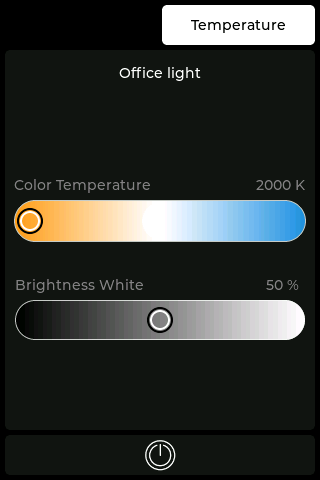
Control Screen:
When you press the tile button the controls screen will appear giving you the ability to adjust the Color Temperature and Brightness White via the sliders. You can also toggle the tile on | off by pressing the light bulb button at the bottom of the popup.
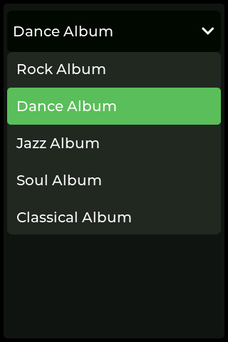
dropDown
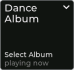
This tile type dropDown may be used to present the user with a drop-down menu. The tile has no internal state management, so it's necessary to send the list of items in the drop-down to the tile via the cmnd/ topic. Once a selection is made from the dropdown, it's sent back to the event parameter.
To clear a selection from the parent tile an empty "dropDownList": [] can be sent. This reverts to the previously configured icon.
{
  "screens": [
    {
      "screen": 1,
      "label": "Demo",
      "tiles": [
        {
          "tile": 1,
          "style": "dropDown",
          "icon": "_music",
          "label": "Select Album"
        }
      ]
    }
  ]
}
JSON parameters
| Parameter | Type | Options | Description | |
|---|---|---|---|---|
tile | Number | n/a | Enter your tile number e.g. 1 | Required |
style | String | n/a | Enter tile style name dropDown | Required |
icon | String | n/a | Enter icon name e.g._music | Optional |
label | String | n/a | Enter label text e.g.Select Album | Optional |
conf/<device-client-id>
{
  "screen": 1,
  "tile": 1,
  "style": "dropDown",
  "type": "dropDown",
  "event": "selection",
  "state": 2
}
JSON parameters
| Parameter | Type | Options | Description |
|---|---|---|---|
screen | Number | n/a | Screen number triggering state event |
tile | Number | n/a | Tile number triggering state event |
style | String | n/a | |
type | String | n/a | |
event | String | n/a | |
state | Number | n/a | Item selected (1-based index of dropDownList) |
stat/<device-client-id>
{
  "tiles": [
    {
      "screen": 1,
      "tile": 1,
      "dropDownList": ["Rock Album", "Dance Album", "Jazz Album", "Soul Album", "Classical Album"],
      "dropDownSelect": 2,
      "subLabel": "playing now"
    }
  ]
}
JSON parameters
| Parameter | Type | Options | Description | |
|---|---|---|---|---|
screen | Number | n/a | Screen number sending command to | Required |
tile | Number | n/a | Tile number sending command to | Required |
dropDownList | Array | n/a | List items Array of Strings ["Rock Album", "Dance Album", "Jazz Album"] | Optional |
dropDownSelect | Number | n/a | Selected item in dropdown list (1-based index of dropDownList) | Optional |
subLabel | String | n/a | String for additional tile information e.g. last updated "playing now" | Optional |
cmnd/<device-client-id>
Control Screen:
When you press the tile button the dropdown list screen will appear giving you the ability to select from the list of items.
buttonSelector
This tile type buttonSelector acts in much the same way as the dropDown tile style, except that the options are displayed within the tile itself rather than on a control screen. It's useful for quickly seeing options without leaving the main screen.
{
  "screens": [
    {
      "screen": 1,
      "label": "Demo",
      "tiles": [
        {
          "tile": 1,
          "style": "buttonSelector",
          "icon": "_ceilingfan",
          "label": "Fan Speed"
        }
      ]
    }
  ]
}
JSON parameters
| Parameter | Type | Options | Description | |
|---|---|---|---|---|
tile | Number | n/a | Enter your tile number e.g. 1 | Required |
style | String | n/a | Enter tile style name buttonSelector | Required |
icon | String | n/a | Enter icon name e.g._music | Optional |
label | String | n/a | Enter label text e.g.Fan Speed | Optional |
conf/<device-client-id>
{
  "screen": 1,
  "tile": 1,
  "style": "buttonSelector",
  "type": "buttonSelector",
  "event": "selection",
  "state": 2
}
JSON parameters
| Parameter | Type | Options | Description |
|---|---|---|---|
screen | Number | n/a | Screen number triggering state event |
tile | Number | n/a | Tile number triggering state event |
style | String | n/a | |
type | String | "selector"|"button" | |
event | String | "selection"|"single" | |
state | Number | n/a | Item selected (1-based index of buttonSelector) |
stat/<device-client-id>
{
  "tiles": [
    {
      "screen": 1,
      "tile": 1,
      "selectorList": ["off", "low", "medium", "full"],
      "selectorSelect": 1,
      "subLabel": "Level"
    }
  ]
}
JSON parameters
| Parameter | Type | Options | Description | |
|---|---|---|---|---|
screen | Number | n/a | Screen number sending command to | Required |
tile | Number | n/a | Tile number sending command to | Required |
selectorList | Array | n/a | List items Array of Strings ["off", "low", "medium", "full"] | Optional |
selectorSelect | Number | n/a | Selected item in dropdown list (1-based index of selectorList) | Optional |
subLabel | String | n/a | String for additional tile information e.g. last updated "Level" | Optional |
cmnd/<device-client-id>
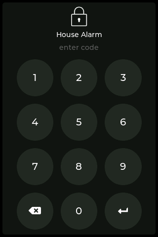
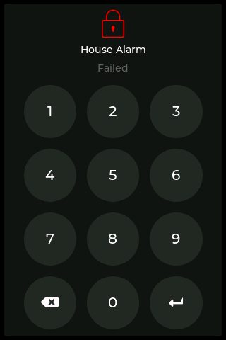
keyPad
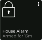
This tile type keyPad may be used to present the user with a keypad. The tile has no internal state management, so you will be required to store and verify valid pin codes for example using Node RED.
Once you verify the pincode you can close the keypad control screen by sending a payload to the cmnd/ topic setting keypad state to 'close'. Then send a payload to the cmnd/ topic to load the desired screen. (See the Load Screen payload in Device Payloads on how to load a screen)
{
  "screens": [
    {
      "screen": 1,
      "label": "Demo",
      "tiles": [
        {
          "tile": 1,
          "style": "keyPad",
          "icon": "_locked",
          "label": "House Alarm"
        }
      ]
    }
  ]
}
JSON parameters
| Parameter | Type | Options | Description | |
|---|---|---|---|---|
tile | Number | n/a | Enter your tile number e.g. 1 | Required |
style | String | n/a | Enter tile style name keyPad | Required |
icon | String | n/a | Enter icon name e.g._unlocked | Optional |
label | String | n/a | Enter label text e.g.House Alarm | Optional |
conf/<device-client-id>
{
  "screen": 1,
  "tile": 1,
  "style": "keyPad",
  "type": "button",
  "event": "key",
  "state": "on",
  "keyCode": "1234"
}
JSON parameters
| Parameter | Type | Options | Description |
|---|---|---|---|
screen | Number | n/a | Screen number triggering state event |
tile | Number | n/a | Tile number triggering state event |
style | String | n/a | |
type | String | n/a | |
event | String | n/a | |
state | Number | "on" | "off" | Item number selected |
keyCode | String | n/a | Code entered - NOTE: this is plain text |
stat/<device-client-id>
{
  "tiles": [
    {
      "screen": 1,
      "tile": 1,
      "icon": "_locked",
      "keyPad": {
        "state": "failed",
        "text": "Failed",
        "icon": "_locked",
        "iconColorRgb": {
          "r": 255,
          "g": 0,
          "b": 0
        }
      }
    }
  ]
}
JSON parameters
| Parameter | Type | Options | Description | |
|---|---|---|---|---|
state | String | "close" | "failed" | "unlocked" | "locked" | Update the tile state | Required |
text | String | n/a | Keypad status label (optional, displays "state" if omitted) | Required |
iconColorRgb | Object | n/a | Change RGB colour of the keyPad icon | Optional |
r | Number | n/a | Red colour Number between 0-255 | Optional |
g | Number | n/a | Green colour Number between 0-255 | Optional |
b | Number | n/a | Blue colour Number between 0-255 | Optional |
subLabel | String | n/a | String for additional tile information e.g. last updated "Armed for 13m" | Optional |
cmnd/<device-client-id>
Control Screen:
When you press the keypad tile the keypad screen will appear giving you the ability to enter the code.
keyPadBlocking
If you wish to lock access to the screen and only allow access to users with a valid pin you are able to set this via a configuration payload. Note this is a 'Device' configuration payload.
{
  "noActivitySecondsToLock": 60
}
JSON parameters
| Parameter | Type | Options | Description | |
|---|---|---|---|---|
noActivitySecondsToLock | Number | n/a | Lock Panel after a period of in-activity. Must be a number between 0 and 3600 (seconds) e.g. 60 is 1 minute | Required |
conf/<device-client-id>
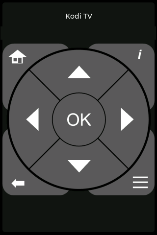
remote

This tile type remote may be used to present the user with a media remote keypad. The tile has no internal state management.
{
  "screens": [
    {
      "screen": 1,
      "label": "Demo",
      "tiles": [
        {
          "tile": 1,
          "style": "remote",
          "icon": "_remote",
          "label": "Kodi TV"
        }
      ]
    }
  ]
}
JSON parameters
| Parameter | Type | Options | Description | |
|---|---|---|---|---|
tile | Number | n/a | Enter your tile number e.g. 1 | Required |
style | String | n/a | Enter tile style name remote | Required |
icon | String | n/a | Enter icon name e.g._remote | Optional |
label | String | n/a | Enter label text e.g.Kodi TV | Optional |
conf/<device-client-id>
{
  "screen": 1,
  "tile": 1,
  "style": "remote",
  "type": "up",
  "event": "single"
}
JSON parameters
| Parameter | Type | Options | Description |
|---|---|---|---|
screen | Number | n/a | Screen number triggering state event |
tile | Number | n/a | Tile number triggering state event |
style | String | n/a | Tile style remote |
type | String | "home" | "info" | "back" | "list" | "ok" | "up" | "down" | "left" | "right" | Indicates which mote button on the popup screen was pressed |
event | String | "single" | "hold" | single | hold events |
stat/<device-client-id>
{
  "tiles": [
    {
      "screen": 1,
      "tile": 1,
      "state": "on",
      "subLabel": "on just now"
    }
  ]
}
JSON parameters
| Parameter | Type | Options | Description | |
|---|---|---|---|---|
screen | Number | n/a | Screen number sending command to | Required |
tile | Number | n/a | Tile number sending command to | Required |
state | String | "on"|"off" | Updated the tile state | Optional |
subLabel | String | n/a | String for additional tile information e.g. "on just now" | Optional |
cmnd/<device-client-id>
Control Screen:
When you press the tile button the remote screen will appear giving you the ability to interact with the remote controls.
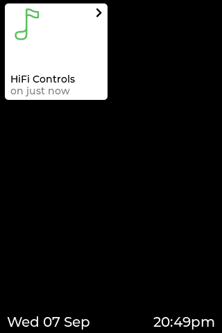
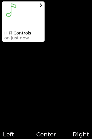
link

This tile type link may be used to switch to another screen when pressed. This can also be done with a simple button tile set to trigger a screen load command in Node-RED, but this tile has a little visual indicator and negates the need to handle screen switches outside of the touch panel.
{
  "screens": [
    {
      "screen": 1,
      "label": "Demo",
      "tiles": [
        {
          "tile": 1,
          "style": "link",
          "icon": "_music",
          "label": "HiFi Controls",
          "link": 2
        }
      ]
    }
  ]
}
JSON parameters
| Parameter | Type | Options | Description | |
|---|---|---|---|---|
tile | Number | n/a | Enter your tile number e.g. 1 | Required |
style | String | n/a | Enter tile style name link | Required |
icon | String | n/a | Enter icon name e.g._music | Optional |
label | String | n/a | Enter label text e.g.HiFi Controls | Optional |
link | Number | n/a | Number of screen which is loaded upon press event | Required |
conf/<device-client-id>
{
  "screen": 1,
  "type": "screen",
  "event": "change",
  "state": "loaded"
}
JSON parameters
| Parameter | Type | Options | Description |
|---|---|---|---|
screen | Number | n/a | Screen number triggering state Event |
type | String | n/a | |
event | String | n/a | change events |
state | String | "loaded" | "unloaded" | loaded | unloaded events |
stat/<device-client-id>
{
  "tiles": [
    {
      "screen": 1,
      "tile": 1,
      "state": "on",
      "subLabel": "on just now"
    }
  ]
}
JSON parameters
| Parameter | Type | Options | Description | |
|---|---|---|---|---|
screen | Number | n/a | Screen number sending command to | Required |
tile | Number | n/a | Tile number sending command to | Required |
state | String | "on"|"off" | Updated the tile state | Optional |
subLabel | String | n/a | String for additional tile information e.g. "on just now" | Optional |
cmnd/<device-client-id>
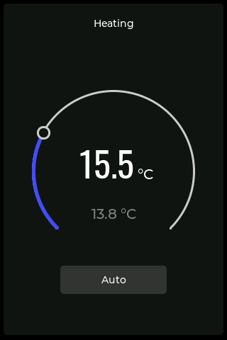
thermostat
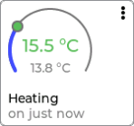
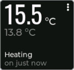
The thermostat tile style provides a function allowing the user to see the actual temperature and the target temperature, with the ability to control the target temperature. Two visual styles are possible, a dynamic arc tile and a digital display style.
{
  "screens": [
    {
      "screen": 1,
      "label": "Demo",
      "tiles": [
        {
          "tile": 1,
          "style": "thermostat",
          "label": "Heating",
          "icon": "_thermostat"
        }
      ]
    }
  ]
}
JSON parameters
| Parameter | Type | Options | Description | |
|---|---|---|---|---|
tile | Number | n/a | Enter your tile number e.g. 1 | Required |
style | String | n/a | Enter tile style name thermostat | Required |
label | String | n/a | Enter label text e.g.Heating | Required |
icon | String | n/a | Set to _thermostat for dynamic Arc tile, dont specify for digits | Required |
conf/<device-client-id>
{
"screen": 1,
"tile": 1,
"style": "thermostat",
"type": "thermostat",
"event": "change",
"state": {
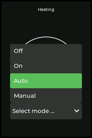
"mode": 3,
"targetTemperature": 155
}
}
JSON parameters
| Parameter | Type | Options | Description |
|---|---|---|---|
screen | Number | n/a | Screen number triggering state event |
tile | Number | n/a | Tile number triggering state event |
style | String | n/a | Tile style _thermostat |
type | String | "button" | "thermostat" | |
event | String | "hold"|"release"|"change" | hold ,release events only on type button. change events only on type themrmostat |
state | String | Object | "on" | "off" | {} | The current tile state |
mode | Number | n/a | The current mode state (1-based index of modeList) |
targetTemperature | Number | n/a | The current target temperature |
stat/<device-client-id>
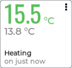
{
  "tiles": [
    {
      "screen": 1,
      "tile": 1,
      "number": {
        "value": "15.5",
        "units": "°C",
        "subValue": "13.8",
        "subUnits": "°C"
      },
      "state": "off",
      "thermostat": {
        "modeList": ["Off", "On", "Auto", "Maunal"],
        "mode": 1,
        "targetTemperature": 155,
        "currentTemperature": 138,
        "units": "°C"
      },
      "subLabel": "off just now"
    }
  ]
}
JSON parameters
| Parameter | Type | Options | Description | |
|---|---|---|---|---|
screen | Number | n/a | Screen number sending command to e.g. 1 | Required |
tile | Number | n/a | Tile number sending command to e.g. 1 | Required |
number | Object | n/a | Number object only used when icon not specified | Optional |
value | String | n/a | Formatted value to display e.g. 15.5 (restricted to 0...9 + - . : ) | Optional |
units | String | n/a | Suffix/unit e.g. "°C" | Optional |
subValue | String | n/a | Formatted sub-value to display e.g. 13.8 | Optional |
subUnits | String | n/a | Suffix/unit e.g. "°C" | Optional |
state | String | "on"|"off" | Update the tile state | Optional |
thermostat | Object | n/a | Optional | |
modeList | Array | n/a | Array of strings to populate mode dropdown in thermostat popup | Optional |
mode | Number | n/a | Set value in mode dropdown in thermostat popup (1-based index of modeList) | Optional |
targetTemperature | Number | n/a | Integer increments by 0.5 in thermostat popup 155 = 15.5 | Optional |
currentTemperature | Number | n/a | Integer in thermostat popup 138 = 13.8 | Optional |
units | String | n/a | Suffix/unit in thermostat popup e.g. "°C" | Optional |
subLabel | String | n/a | String for additional tile information e.g. last updated "off just now" | Optional |
cmnd/<device-client-id>
Control Screen:
When you press the tile the thermostat popup screen will appear giving you the ability to interact with the thermostat controls.
Common Tile Payloads
These commands and configs are common to all tile styles.
Set the size of a tile (appearance on screen)
The size of a tile can be changed in increments of grid cells (tiles) by spanning the tile to the right and / or down. The referenced tile acts as the parent tile and all payloads are addressed to and from it. The user has to make sure that spanned grid cells aren't used by other tiles (possible collision with other tiles is not checked by the FW)
{
  "tiles": [
    {
      "screen": 1,
      "tile": 1,
      "span": {
	    "right": 2,
		"down": 2
	  }
    }
  ]
}
JSON parameters
| Parameter | Type | Options | Description | |
|---|---|---|---|---|
screen | Number | n/a | Screen number sending command | Required |
tile | Number | n/a | Tile number sending command | Required |
span | Object | n/a | Required | |
right | Number | n/a | number of grid cells to span right (defaults to 1) | Required |
left | Number | n/a | number of grid cells to span down (defaults to 1) | Required |
conf/<device-client-id>
Display a level indicator
A visual indicator of light or blind levels. Although this is more suited to the buttonUpDownLevel or buttonUpDown styles, it works on all tile styles.
{
  "tiles": [
    {
      "screen": 1,
      "tile": 1,
      "levelBottom": 0,
      "levelTop": 100
    }
  ]
}
conf/<device-client-id>
{
  "level": 50,
  "state": on
}
cmnd/<device-client-id>
Set the background color
RGB color for a tile background (defaults to the parent screen background color).
{
  "tiles": [
    {
      "screen": 1,
      "tile": 1,
      "backgroundColorRgb": {
        "r": 255,
        "g": 0,
        "b": 0
      }
    }
  ]
}
JSON parameters
| Parameter | Type | Options | Description | |
|---|---|---|---|---|
screen | Number | n/a | Screen number sending command | Required |
tile | Number | n/a | Tile number sending command | Required |
backgroundColorRgb | Object | n/a | Required | |
r | Number | n/a | Red colour Number between 0-255 | Required |
g | Number | n/a | Green colour Number between 0-255 | Required |
b | Number | n/a | Blue colour Number between 0-255 | Required |
cmnd/<device-client-id>
Set the icon color
RGB color for a tile icon (defaults to white if the tile state is "off", or the configured device "on" icon color if the tile state is "on").
{
  "tiles": [
    {
      "screen": 1,
      "tile": 1,
      "iconColorRgb": {
        "r": 255,
        "g": 0,
        "b": 0
      }
    }
  ]
}
JSON parameters
| Parameter | Type | Options | Description | |
|---|---|---|---|---|
screen | Number | n/a | Screen number sending command | Required |
tile | Number | n/a | Tile number sending command | Required |
iconColorRgb | Object | n/a | Required | |
r | Number | n/a | Red colour Number between 0-255 | Required |
g | Number | n/a | Green colour Number between 0-255 | Required |
b | Number | n/a | Blue colour Number between 0-255 | Required |
cmnd/<device-client-id>
Add a "tag" to the tile configuration
The "tag" can be added to the tile properties via conf\ or cmnd\payloads. If exists, it wil be reported back as "tag" as part of the tile event. This feature can be used by the backend (NR) to further customize the tile and create specific reactions depending on the "tag" content.
{
  "tiles": [
    {
      "screen": 1,
      "tile": 1,
      "tag": {
	    "Any text"
	  }
    }
  ]
}
JSON parameters
| Parameter | Type | Options | Description | |
|---|---|---|---|---|
screen | Number | n/a | Screen number sending command | Required |
tile | Number | n/a | Tile number sending command | Required |
tag | String | n/a | Any text (plain or formatted (JSON)) | Optional |
conf/<device-client-id>
{
  "tiles": [
    {
      "screen": 1,
      "tile": 1,
      "tag": {
	    "Any text"
	  }
    }
  ]
}
JSON parameters
| Parameter | Type | Options | Description | |
|---|---|---|---|---|
screen | Number | n/a | Screen number sending command | Required |
tile | Number | n/a | Tile number sending command | Required |
tag | String | n/a | Any text (plain or formatted (JSON)) | Optional |
cmnd/<device-client-id>
Actions to remove or disable a tile
- Removes a tile from the configuration.
- Disables touch input for a tile. The tile is greyed out. State changes are still updated.
{
  "tiles": [
    {
      "screen": 1,
      "tile": 1,
      "action": "remove"
    }
  ]
}
JSON parameters
| Parameter | Type | Options | Description | |
|---|---|---|---|---|
screen | Number | n/a | Screen number sending command to | Required |
tile | Number | n/a | Tile number to be removed | Required |
action | String | "remove"|"disable"|"enable" | Command to remove\disable\re enable tile | Required |
cmnd/<device-client-id>
Screen conf/Payloads
Each individual screen can be configured by adding one ore more of the following options to the conf/ payload.
| Parameter | Description |
|---|---|
label | The label that will be shown in the footer of the screen and in the screen selection drop-down |
hidden | Hiding a screen prevents it from being shown when swiping or in the screen selection drop-down. The screen can still be shown with a cmnd, or a tile linked to that screen within the conf. |
backgroundColorRgb | Defines the background color for this screen |
screenLayout | Defines the the grid that serves space for the tiles |
horizontal | Size of the grid (tile count) in horizontal direction (max 10) |
vertical | Size of the grid (tile count) in vertical direction (max 10) |
Properties to configure a screen
{
  "screens": [
    {
      "screen": 5,
      "label": "Demo",
	  "hidden": false,
      "backgroundColorRgb": {
        "r": 255,
        "g": 0,
        "b": 0
      },
      "screenLayout": {
        "horizontal": 2,
        "vertical": 2
      },
	  "tiles" [
	    .....
	  ]
    }
  ]
}
JSON parameters
| Parameter | Type | Options | Description | |
|---|---|---|---|---|
screen | Number | n/a | Screen number to be configured | Required |
label | String | "Demo" | Label to be shown in the footer (defaults to "Screen nn") | Optional |
hidden | Boolean | true | false | Config to hide screen (defaults to "false") | Optional |
backgroundColorRgb | Object | n/a | Optional | |
r | Number | n/a | Red colour Number between 0-255 | Optional |
g | Number | n/a | Green colour Number between 0-255 | Optional |
b | Number | n/a | Blue colour Number between 0-255 | Optional |
screenLayout | Object | n/a | Optional | |
horizontal | Number | n/a | Tiles (grid) horizontal Number between 1-10 | Optional |
vertical | Number | n/a | Tiles (grid) vertical Number between 1-10 | Optional |
conf/<device-client-id>
TIP
A hidden screen can be useful for scenarios where you only want a screen to be displayed when reacting to some kind of internal logic (e.g. a tile pressed) or external logic (e.g. a sensor receives a command).
Either way, the best way to show the screen which is flagged as hidden is to load the screen, see Load Screen.
Screen cmnd/Payloads
These commands are specific to an individual screen.
Remove a screen from the configuration
Removes a screen from the configuration.
{
  "screens": [
    {
      "screen": 2,
      "action": "remove"
    }
  ]
}
JSON parameters
| Parameter | Type | Options | Description | |
|---|---|---|---|---|
screen | Number | n/a | Screen number to be removed | Required |
action | String | "remove" | Command to remove screen | Required |
cmnd/<device-client-id>
TIP
Removing a screen removes all tiles on this screen as well.
Removing screen 1 (Home Screen) technically removes screen 1 and creates an empty screen 1 (Home Screen)
Set the background color
RGB color for a screen background (defaults to the configured device background color).
{
  "screens": [
    {
      "screen": 1,
      "backgroundColorRgb": {
        "r": 255,
        "g": 0,
        "b": 0
      }
    }
  ]
}
JSON parameters
| Parameter | Type | Options | Description | |
|---|---|---|---|---|
screen | Number | n/a | Screen number sending command to | Required |
backgroundColorRgb | Object | n/a | Required | |
r | Number | n/a | Red colour Number between 0-255 | Required |
g | Number | n/a | Green colour Number between 0-255 | Required |
b | Number | n/a | Blue colour Number between 0-255 | Required |
cmnd/<device-client-id>
Set footer
{
  "screens": [
    {
      "screen": 1,
      "footer": {
        "left": "Wed 07 Sep",
        "center": "",
        "right": "20:49pm"
      }
    }
  ]
}
JSON parameters
| Parameter | Type | Options | Description | |
|---|---|---|---|---|
screen | Number | n/a | Screen number sending command to | Required |
footer | Object | n/a | Required | |
left | String | n/a | Left aligned String for additional tile information | Optional |
center | String | n/a | Centrally aligned String for additional tile information | Optional |
right | String | n/a | Right aligned String for additional tile information | Optional |
cmnd/<device-client-id>
TIP
<text> supports coloring using"#RRGGBB <text>#" tags where RRGGBB are hex, e.g. “#FF0000 RED#”.
Missing key shows the default icon/string (empty) hides the default icon/string "<any text>" replaces the default icon/string with "<any text>" an empty list "footer":{} resets all to default
Device Payloads
These are configuration and command payloads for the device itself.
Load Screen
This command gives you the ability to load a specific screen on a device.
{
  "screen": {
    "load": 2
  }
}
JSON parameters
| Parameter | Type | Options | Description | |
|---|---|---|---|---|
screen | Object | n/a | Required | |
load | Number | n/a | specify screen number you wish to load 1-32 | Required |
cmnd/<device-client-id>
Set the background color
Default RGB color for screen backgrounds (defaults to black - R0, G0, B0). If there is no explicit screen or tile background color defined then this is the fallback color used to render a screen or tile.
TIP
The configured background color has the lowest precendence and will only be used if no background color has been set for the screen or tile being displayed.
{
  "backgroundColorRgb": {
    "r": 255,
    "g": 0,
    "b": 0
  }
}
JSON parameters
| Parameter | Type | Options | Description | |
|---|---|---|---|---|
backgroundColorRgb | Object | n/a | Required | |
r | Number | n/a | Red colour Number between 0-255 | Required |
g | Number | n/a | Green colour Number between 0-255 | Required |
b | Number | n/a | Blue colour Number between 0-255 | Required |
conf/<device-client-id>
Set the "on" icon color
RGB color of icon when 'on' (defaults to light green - R91, G190, B91).
{
  "iconOnColorRgb": {
    "r": 255,
    "g": 0,
    "b": 0
  }
}
JSON parameters
| Parameter | Type | Options | Description | |
|---|---|---|---|---|
iconOnColorRgb | Object | n/a | Required | |
r | Number | n/a | Red colour Number between 0-255 | Required |
g | Number | n/a | Green colour Number between 0-255 | Required |
b | Number | n/a | Blue colour Number between 0-255 | Required |
conf/<device-client-id>
Change the state dependent brightness of a tile
Per default the background of a tile appears with a brightness level of 10 when in off state and with 100 when in on. In some configurations , eg. when a lighter color schema is used, these defaults don't let the tile stand out nicely from the background or the on state appreas too bright. To get a nicer contrast between tile and screen background the brightness for the two states are configurable. Note: make sure this configuration has been set before tiles are configured.
{
  "tileBrightnessOff": 10,
  "tileBrightnessOn": 80
}
JSON parameters
| Parameter | Type | Options | Description | |
|---|---|---|---|---|
tileBrightnessOff | Number | n/a | brightness in off between 0-25 | Required |
tileBrightnessOn | Number | n/a | brightness in on between 75-100 | Required |
conf/<device-client-id>
Home screen timeout
Return to home screen after a period of in-activity (defaults to 0 which disables the timeout). Must be a number between 0 and 600 (i.e. 10 minutes).
{
  "noActivitySecondsToHome": 60
}
JSON parameters
| Parameter | Type | Options | Description | |
|---|---|---|---|---|
noActivitySecondsToHome | Object | n/a | Return to home screen after in-activity | Optional |
conf/<device-client-id>
Screen sleep timeout
Turn off screen backlight after a period of in-activity (defaults to 0 which disables the timeout). Must be a number between 0 and 3600 (i.e. 1 hour).
{
  "noActivitySecondsToSleep": 60
}
JSON parameters
| Parameter | Type | Options | Description | |
|---|---|---|---|---|
noActivitySecondsToSleep | Object | n/a | Turn off backlight after in-activity | Optional |
conf/<device-client-id>
Control the backlight brightness
The backlight level can be set via the slider on the settings screen or with an MQTT Payload.
{
  "backlight":{
    "brightness": <number>
  }
}
cmnd/<device-client-id>
{
  "type": "backlight",
  "event": "change",
  "state": "sleep"|"awake",
  "brightness": <number>
}
stat/<device-client-id>
TIP
<number> number between 1 .. 100 [%]
The backlight state can be set to on or off. Additionally a "Screen Sleep Timeout" can be set via the Admin UI config page.
Control the backlight state
The backlight state can be set with an MQTT Payload.
{
  "backlight":{
    "state": "awake"
  }
}
JSON parameters
| Parameter | Type | Options | Description | |
|---|---|---|---|---|
backlight | Object | n/a | control the backlight | Required |
state | String | "awake" | "sleep" | force the backlight state | Optional |
cmnd/<device-client-id>
{
  "type": "backlight",
  "event": "change",
  "state": "sleep"|"awake",
  "brightness": <number>
}
stat/<device-client-id>
TIP
Setting the "awake" state by a cmnd/ can be usefull when there is a NR controled screen change or pop-up message that the user shall be made aware of independent of the recent backlight state. The following sequence should be used:
{
  "messageBox": {
    "title": "Attention!"
	},
  "backlight": {
    "state":"awake"
	}
}
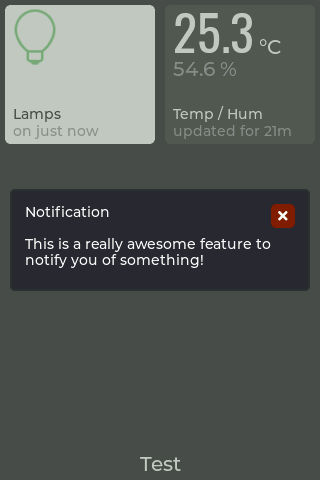
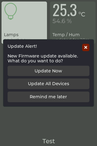
Popup Message Box Modal
This feature can be used to display a message on the screen. Make the most of this function by enhancing its interactivity with custom buttons. When these buttons are pressed, their actions are reported back to the state topic, allowing for a more dynamic user experience. Additionally, users can still close the message or clear it by sending an empty message payload, triggering relevant state events.
{
  "messageBox": {
    "title": "Update Alert!",
    "text": "New Firmware update available. \nWhat do you want to do?",
    "buttons": ["Update Now", "\n", "Update All Devices", "\n", "Remind me later"]
  }
}
JSON parameters
| Parameter | Type | Options | Description | |
|---|---|---|---|---|
messageBox | Object | n/a | Required | |
title | String | n/a | Message title text, supports text formatting syntax like colors etc | Required |
text | String | n/a | Message body text, supports text formatting syntax like new lines, colors etc | Required |
buttons | Array | n/a | An array of strings, max 5 buttons. Each button has a max 40 character limit. Specifying "\n" defines that the button position is to be blank. See tip below for more details | Optional |
Dynamically Close Modal Pop-up
To close a modal pop-up simply send the messageBox property with an empty object:
{
  "messageBox": {}
}
cmnd/<device-client-id>
{
  "type": "messageBox",
  "event": "open"|"acknowledge"|"revoke"|"remove"|"button",
  "state": "open"|"closed"|"button-text"
}
JSON parameters
| Parameter | Type | Options | Description |
|---|---|---|---|
type | String | messageBox | |
event | String | "open" | "acknowledge" | "revoke" | "remove" | "button" | event type |
state | String | "open" | "closed" | "open" | "button-text" | 'button-text' will be the string contained in your button |
stat/<device-client-id>
WARNING
When employing an interactive message box modal with a custom button and it is pressed, the state payload will capture the text value of the pressed button. Any text formatting incorporated into the button, such as "#FF000000 Update Now," will also be encompassed within the state property.
TIP
The messageBox payload will not wake up a sleeping screen
Button Configuration Examples
Dynamic Button Layout Based on Text and Array Configuration
The arrangement of buttons dynamically adapts based on the interplay between populated button text and the array, where blank entries are defined using \n. The provided example illustrates achieving a layout with three vertically stacked full-width buttons. Experiment with different combinations to explore the range of possibilities and discover what suits your needs.
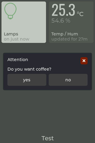
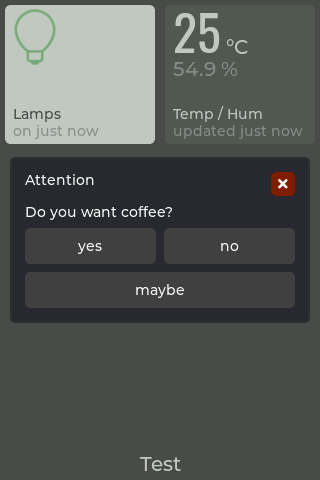
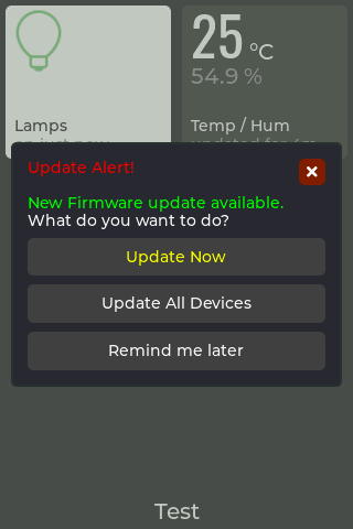
{
  "messageBox": {
    "title": "Attention",
    "text": "Do you want coffee?",
    "buttons": ["yes", "no"]
  }
}
cmnd/<device-client-id>
{
  "messageBox": {
    "title": "Attention",
    "text": "Do you want coffee?",
    "buttons": ["yes", "no", "\n", "maybe"]
  }
}
cmnd/<device-client-id>
{
  "messageBox": {
    "title": "#ff0000 Update Alert!#",
    "text": "#00ff00 New Firmware update available.#\nWhat do you want to do?",
    "buttons": ["#ffff00 Update Now#", "\n", "Update All Devices", "\n", "Remind me later"]
  }
}
cmnd/<device-client-id>
Add a custom icon
There are a limited set of built-in icons available, but it is possible to upload custom icons for use in your tile configuration. The built-in icons are sourced from icons8.com but you can use any icon you want. This provides a great way to customise your touch panel.
TIP
Custom icons
- are not persistent and have to be (re)loaded after restart.
- are referenced by their name.
- name CAN NOT begin with and underscore '_' (reserved).
- are shown after they are loaded (before or after configured).
- reloading an existing image with new content will update all tiles.
{
  "addIcon": {
    "name": "<text>",
    "imageBase64": "<encodeBase64(.png)>"
  }
}
cmnd/<device-client-id>
How to prepare an icon for use
- Custom icons need to be in .PNG format
- Custom icons appear in alphabetical order after the built-in icons (which are preceded with "_")
- Icon upload is performed using the
addIconcommand - To upload via MQTT the icon has to be Base64 encoded using one of the following methods;
- Use the OXRS Asset Generator which generates the required JSON payload ready-to-use
- Use an online converter like base64encode.org
- Use Node-RED node-red-node-base64 for automated conversion
- Ensure there is no extra information added to the Base64 encoded file
- The encoded image should not exceed 4KB to avoid crashes
- If using the AdminUI, after uploading a custom icon the "Edit Config" page needs to be refreshed to update the icon list
Icon size and alignment
- The tile layout is optimised for 60x60 pixel icons
- Max icon size is approx. 140x140 pixels (the tile size)
- Icons are aligned top/left of a tile
- There are no size checks for custom icons
Add a tile background image
It is possible to upload custom images to be used for the background of your tile. They can be sourced in the same way as the icons are but are also able to be in colour. This provides a great way to customise your touch panel.
{
  "addImage": {
    "name": "myCustomImage",
    "imageBase64": "iVBORw0KGgoAAAANSUhEUgAAAB4AAAAeCAYAAAA7MK6iAAAACXBIWXMAAAsTAAALEwEAmpwYAAABP0lEQVR4nO3WTUoDQRCG4Rf8iXvjIOgN9ATiCQI5Qg4gIp7CpSh6FxciCCrERBf+IN4iII4iEmkZqJZOMyPpproX4gdFwiRTz0yniwn8Z7qsA/vAA/AClMATcASskSALwAEwBkxDfQHHQEsLbQEnv4B+nQHzsVgXOJel/AhAbVVLH5y9CMivcehv3lFAbR2GwKeK8N00YLWBdoB3RfhTejZutFXgXhGsu/OVuvlMiRoHn5jv3QyokaqW/SfDiAYbwGbEedcu/BbRwCb0vFcXLjPCpQsPMsJ9F97OCG+58FzEBouB+8CsP8tt4CohfAks0pAZoCfP0pECPJJePemtEv8CssX8efgCuAWKGriQzyZmVCtDgR4FsnAhx4x8Rz2FA9hX9729oCRZkj/x/tg8A8upUBrwLKhNtaQ3UlHL+w2p26ZRV2/CNAAAAABJRU5ErkJggg=="
  }
}
JSON parameters
| Parameter | Type | Description |
|---|---|---|
addImage | Object | |
name | String | name of image |
imageBase64 | String | base64 encoded string of image |
cmnd/<device-client-id>
TIP
Background images
- are not persistent and have to be (re)loaded after restart.
- are referenced by their name.
- name CAN NOT begin with and underscore '_' (reserved).
- are shown after they are loaded (before or after configured).
- reloading an existing image with new content will update all tiles.
Setting a tile background image
{
  "tiles":[
    {
      "screen": 1,
      "tile": 1,
      "backgroundImage": {
        "name": "myCustomImage",
        "zoom": <number>,
        "angle": 90,
        "offset": [<x number>,<y number>]
      }
    }
  ]
}
JSON parameters
| Parameter | Type | Description |
|---|---|---|
backgroundImage | Object | |
name | String | name of image |
zoom | Number | ... |
angle | Number | integer that defines the rotation angle in increments of 0.1 deg (eg 900 = 90 deg). A positive number rotates the image CW , a negative number rotates it CCW |
offset | Array[Number, Number] | ... |
cmnd/<device-client-id>
Removing a tile background image
{
  "tiles": [
    {
      "screen": 1,
      "tile": 1,
      "backgroundImage": {}
    }
  ]
}
cmnd/<device-client-id>
TIP
Remove the image by sending a payload with a blank value for imageBase64
How to prepare an image for use
- Background images need to be in .PNG format converted into a Base64 encoded string
- Use the OXRS Asset Generator which generates the required JSON payload ready-to-use, just change the property addIcon to addImage.
- Use an online converter like base64encode.org
- Use Node-RED node-red-node-base64 for automated conversion
- Ensure there is no extra information added to the Base64 encoded file
- The encoded image should not exceed 4KB to avoid crashes - TBC
Image size and alignment
- The tile layout is optimised for 60x60 pixel icons
- Max image size is approx. 140x140 pixels (the tile size)
- Images are aligned to the centre of the tile
- There are no size checks for custom images
- angle is an integer that defines the rotation angle in increments of 0.1 deg (eg 900 = 90 deg), + number rotates CW , - number rotates CCW
Restarting the device
{
  "restart": true
}
cmnd/<device-client-id>
TIP
The device may also be restarted;
- by pressing the "Hold to restart..." button on its settings screen
- from the downloadable Admin UI
Receiving MQTT Payloads
For many of the MQTT payloads you send to your touch panel, it responds by sending a payload back out on the stat/<device-client-id> topic; these are documented above individually for each Tile, Screen, or Device payload.
In addition to these payloads, touch panel sends the following types of payload:
| On event | Type | Topic | Note |
|---|---|---|---|
| When touch panel comes online | LWT payload | stat/<device-client-id>/lwt | commonly used to signal to Node-RED when your device comes online, so it can be configured. Don't forget that most of the touch panel's configuration is done at startup |
| When touch panel comes online | Adopt payload | stat/<device-client-id>/adopt | useful diagnostic data such as firmware and hardware versions, IP and MAC address, a memory object detailing used memory on the touchpanel's microcontroller, plus a config and command schema |
| After screen timeout | Backlight payload | stat/<device-client-id> | to inform you when the backlight comes on or goes off as a result of the sleep timer |
| When screen is changed | Screen load / unload event payload | stat/<device-client-id> | to inform you when a screen was changed either by MQTT or by someone touching the panel |
| Periodically | Climate events | tele/<device-client-id> | temp / humidity data on supported hardware versions (currently 86S) |
TIP
In Node-RED, hook up a couple of MQTT-in nodes, and wire them both to a debug node. Set one MQTT-in node to listen to stat/<device-client-id>/# and the other to tele/<device-client-id>/#, and you can then examine more fully what your device is sending out and when.
Setting Up your Touch Panel
Overview
- Prepare your Touch Panel and connect it to an USB port. Depending on your device type follow the instructions here
- Flash your device using the OXRS-WEB-Flasher. See flashing your device.
- Connect the touch panel to your wired or wireless network. See connecting to WiFi / Ethernet.
- Configure the touch panel to connect to your MQTT broker. See initial MQTT configuration.
- From now-on, you can do everything over MQTT. See how to communicate with your touch panel over MQTT.
General notes on flashing the touch panels
- The WT32-SC01 and WT32-SC01 Plus both have built-in USB and so you don't need an additional USB-TTL adapter. The instructions below include ensuring you have the correct Windows driver to flash the board directly.
- The WT32S3-86V and 86S will require a separate USB-TTL adapter. See notes below.
Preparations for flashing the WT32S3-86V
Note about what USB-TTL to use
Use one of the cheap, ubiquitous USB-TTL adapters available on Amazon or Ebay, and don't purchase the unit with the supplied USB-TTL adapter. If you use the supplied one, it has a dedicated JST cable, the connector for which you will need to solder on to each panel. Being an SMD connector, it's a bit fiddly - but more to the point, once you've soldered it on, you can no longer re-attach the plastic rear panel! So avoid that one and use a standard USB-TTL adapter with normal hookup wires / dupont connectors.
- Let's work on the assumption you have a standard USB-TTL adapter and, if the drivers didn't install to Windows automatically, you have sorted that out already.
- No soldering is required: the touch panel already has a female header strip on the back which you can plug in to directly.
- The female header strip is exposed even when the flat plastic rear panel is on, but to see the pinout labels, just pop-off the rear cover.
- Connect GND and +5V to the header ports, labelled on the back of the panel
- Connect RX and TX out of the USB-TTL to the female headers marked TX0 and RX0 respectively (i.e. RX to TX, and TX to RX)
- With a spare hookup wire, connect between the panel's ground and the panel's IO0, then plug the USB adapter in; powering up with IO0 tied to ground puts the device into flash mode.
Preparations for flashing the WT32-SC01 and SC01 Plus
- Connect the WT32-SC01 LCD dev board USB-C port to a USB connector on the Windows PC using a USB-C to USB-A cable (a USB-C to USB-C cable doesn’t appear to work).
- Ensure the LCD dev board power LED comes on and the screen displays the factory default page display sequence.
- Open the ‘Device Manager’ app (i.e. Invoke Windows logo key+R, type in “devmgmt.msc” and then press Enter), navigate down the devices list to Universal Serial Bus controllers and right click on the USB Root Hub icon.
- If the ‘Device status’ window in the USB Root Hub properties window shows “This device is working properly”, skip to step 8. below.
- If the ‘USB Root Hub properties’ window indicates the ‘CP210x driver is missing’, download the CP210x_Universal_Windows_Driver.zip file to your work folder, and extract its contents.
- Locate the file
silabser.infwithin the extracted folder, right click on it and select Install in the pop-up menu. Then repeat step 5. above.
Flashing Your Device
- Go to the OXRS WEB Flasher
- For
Firmwareselect from the drop downOXRS_IO_TouchPanel-ESP32-FW - For
VersionChoose the version according to- What model of Touch Panel you are flashing (see supported hardware)
- Whether you plan to use WiFi or Ethernet. WiFi is built-in to all touchpanel models so it's a great place to start or for demo purposes. An ethernet connection may offer more long term reliability, so you will need to add a compatible ethernet adapter, for example the PoE ethernet shield from https://www.austinscreations.ca/, open-source designs for which may be found here.
- continue with
CONNECTand follow the instructions.- in the later following dialog Check the
Erase deviceoption for a clean start.
- in the later following dialog Check the
Connecting to WiFi / Ethernet
- WiFi firmware
- Newly flashed panels (WiFi firmware) will broadcast their own SSID, (OXRS-WiFi). Connect to this wireless network from another wireless device.
- The password to connect to OXRS-WiFi is
superhouse - Browse to 192.168.4.1 using Chrome or Microsoft Edge browser (FireFox does not appear to handle the rendered html properly) and then enter the details of your wireless network. Click the Save button, and the touch panel should then connect and appear on your WiFi network.
- Incidentally, Windows has a helpful new feature that can automatically disconnect from a wireless network that doesn't appear to provide it with an internet connection. This gets annoying, because it will disconnect you from the SSID part-way through this process. Disable this in Windows registry by creating a new DWORD value "NoActiveProbe" set to 1, within HKEY_LOCAL_MACHINE\SOFTWARE\Policies\Microsoft\Windows\NetworkConnectivityStatusIndicator.
- If the touch panel has connected to your WiFi network successfully, OR if you uploaded the ethernet firmware and are already physically connected to a switch;
- The panel's IP address and MAC address can be found on the panel itself under settings cog. Note down the IP address and continue to initial MQTT configuration.
Initial MQTT Configuration
- If you have not already done so, download the OXRS Web based administrator UI
index.htmlfile onto to your local machine and open it using your favourite web browser. - Using the displayed OXRS Admin UI page, insert the IP address displayed on the LCD Touchscreen's Settings screen in the Device address field, then choose the Setup MQTT menu option in the Action field, and click the Select button. = Fill out the MQTT Configuration fields displayed to input your MQTT broker settings, and click the Submit button. The LCD Touchscreen Settings page should now confirm the MQTT broker connection, and the yellow warning triangle displayed bottom right on the main default screen should now have disappeared.
- Once you have completed these steps, you can either play with the Admin UI to set up some demo screens, tiles, and icons, or start using the panel in your automations; See how to communicate with your touch panel over MQTT.
API
The Touch Panel firmware implements the standard OXRS REST API endpoints. This allows you to configure the device, send commands, as well as perform OTA updates, restarts and factory resets.
The OXRS Admin UI uses this REST API and is a great place to start with when setting up your device for the first time.
API Endpoints
REST API endpoints have been added to the Touch Panel firmware, these are listed below with a brief explanation;
HTTP GET
/api/snapshot.bmp download a snapshot (approx. 450kB) of the current display, to your computer
/api/snapshot.bmp?tile=<1-n> download a snapshot (approx. 60kB) of the selected tile (1-n) in the current display, to your computer. <n> is the largest tile number available on the sreen depending on your screen specific configuration. If tile number is out of range, the whole current display will be returned.
Climate Sensor Support
ESP32-S3 based panels
The ESP32-S3 chip family has an integrated temerature sensor. This is supported by the FW for all ESP32-S3 based panels. Temperature values are published to the tele/ topic
{
  "esp32Temp":<number>
}
<number> = ESP32-S3 internal temperature in °C
WT32S3-86S panels with built-in SHT20
The WT32S3-86S panel has a built-in SHT20 sensor which measures tempwrature and humidity. This is supported by the FW for this panel. Temperature and humidity values are published to the tele/ topic
{
  "temperature": <number>,
  "humidity": <number>
}
temperature is reported in °C and humidity in %RH
These values are also shown on the Settings screen as Climate
Tip
Some paneles have the I2C pins broken out to accessible connectors. A SHT20 sensor connected to these pins will automatically detected by the FW and supported as a built-in one.
Downloads
Download the latest version of the firmware on Github.
Credits
License
Copyright 2020-present SuperHouse Automation Pty Ltd www.superhouse.tv
The software portion of this project is licensed under the Simplified BSD License. The "licence" folder within this project contains a copy of this license in plain text format.